
Ikea Sleep Guide
Project Summary
This design project shows how two sleep related tools from the IKEA website were combined and redesigned into a new tool: the Sleep Planner. The Sleep Planner functions as an online one-stop shop for IKEA customers who want to configure their complete IKEA bed setup tailored to their personal sleep comfort wishes and requirements. Usability and User Experience analysis done before and and after the redesign shows that the new tool scores better on both Usability and User experience compared to the two separate tools currently used.
Keywords:
UI/UX Design
Usability and UX analysis
Usability testing
User testing
Digital prototyping
Inter IKEA Systems
System Usability Scale (SUS)
AttrakDiff

Design brief
The client of this project (Inter IKEA Systems / IPEX) asked us (5 industrial design students) to assess the usability and user experience of two of IKEA's online bedroom tools (the Comfort Guide and the Bed Configurator) and to come up with alternative design solutions to address potential issues.
The Comfort Guide is a tool that helps customers in selecting sleeping comfort related products, serving as a digital comfort expert. The Bed Configurator enables customers to create a (visual) configuration of all bed-related products. It serves as a “one-stop shop” for customers seeking a complete sleeping set-up, considering both comfort and style.

Research activities
To determine what problems users encounter while using the two tools, both a designers’ first impression analysis and a user test have been conducted. The designers’ first impression analysis was done in the form of a Cognitive Walkthrough which entailed using the two tools with minimal prior research, to get a first impression of the tools with minimal bias.
The user test was performed with ten participants, with the goal to determine (a) what the main points of improvement of both tools are, (b) whether the users encounter recurring obstacles that need to be addressed, (c) whether navigating through the tools is clear to the users, and (d) how convinced users are by the recommended products provided by the tools. After each user test the SUS (System Usability Scale) and AttrakDiff assessments were done. These methods deliver valuable and quantitative insights about the usability and user experience of a product.


Problem definition
Combining these results, the problem categories were concluded and visualized in circles, where the size of the circle shows the frequency of the problem, and the intensity of the color the severity of the problem. To more specifically indicate what UI elements these problems refer back to, two screenshots (one of both tools) with annotations explaining the struggles participants have been added.
The outcomes of the SUS show that the Bed Configurator and Comfort Guide are only moderately usable, with a score of 62 and 64 (out of 100) respectively. Additionally, the outcomes of the AttrakDiff show that both tools also leave room for improvement in terms of user experience.


Design vision
Based on the findings from the research activities, the following design goal statement was formulated for redesigning both tools (see the first image). Next to this, a list of testable targets was made to eventually evaluate our redesign with. Using these testable targets, a list of design criteria was made to be used when working on the redesign.


Multiple concepts
Each team member brainstormed on possible concepts. Since five team members were working on this project, this resulted in five different concepts. Three people kept the two tools separate and two people combined the two tools. These images here show each of these concepts, with two images per concept.

Converging into 1 concept
To evaluate the concepts, the Weighted Objectives method was applied. Each concept was assessed based on 12 criteria, based on the design criteria showed above. The criteria were ranked by importance and were assigned a weight factor accordingly. Each concept was assessed per criterion and received a score between 0 and 10, relative to the current tool receiving 5 out of 10 (i.e. a score higher than a 5 means an improvement on the current tool). These scores were multiplied by the criteria's weight factors, of which the summation led to the total score per concept.
Concept 3B (with the highest total score) has been chosen as a basis for the redesign. Strengths of this concept are that the tool is experienced as intuitive, easy to use and understand (criterion 1), and that the provided product information is relevant (criterion 8). Besides this, the group discussions also resulted in seeing the most potential in this concept when combined with high scoring aspects of the other concepts.


Final redesign
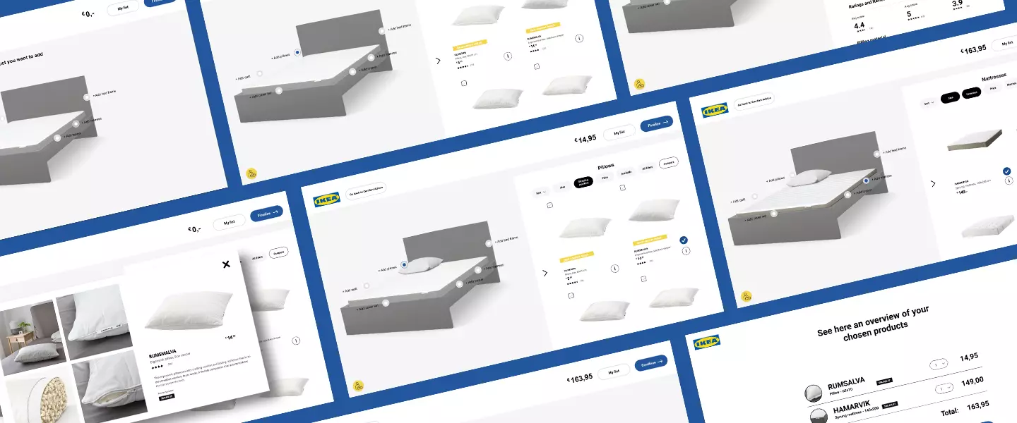
The final redesign is an integration of various elements of the individual concepts, providing advice concerning the most comfortable and therefore personal bed products and giving the possibility to compose a whole bed.
The decision has been made to make an integrated version of the current two tools, the Sleep Planner. The main reason for this decision were that the information the comfort guide offers is equally beneficial for the bed configurator users. Furthermore, it solves the problem that it currently is unclear to most people what the difference in purpose between the two tools. This decision has been discussed with the client before completing the redesign and by showing our take on how to combine the two. He agreed and called this approach “a much smarter way than what we’ve had now”.
The redesign is made interactive using Figma as the tool is advanced enough for this prototype and allows for working together with multiple people on the same file at once.


Project evaluation
To validate the redesign, another user test was performed with 10 participants. Just like the first user test the participants were asked to complete a few tasks within the interactive redesign prototype. Afterwards, the users were asked some questions about their experience, to be rated on scale from 1 to 7. Lastly, they were asked to fill in the SUS and AttrakDiff surveys to compare the results with the results of the current separate tools.
Concluding from the results, the testable targets that were formulated for this redesign were all met. Most participants were able to complete the task with no difficulty. The few issues that did arise are again pointed out in UI screenshots. The participants were very positive about the redesign which also showed in their responses to the questions afterwards. The results from the SUS (System Usability Scale) and AttrakDiff assessments indicate the same improvement.
Some positive responses we received from the participants were:
" The buttons were located where my mouse went automatically. "
" It is nice that there are not too many questions, but only the necessary ones. "
Contact
Do you have a questions regarding any of my projects? Or would you like to share a cup of coffee together and discuss one of them? Don't hesitate to contact me!
Get in contact